My Role
Graphic Designer + Art Director + Production Designer
The Challenge
To garner interest, awareness and to sell Guru Studio's Shows to international markets.
In the animation industry, broadcasters want to know a) the time format b) who else has bought broadcast rights and c) how to reach the studio.
Juggling these pieces of information, as well as the art, main messaging and keeping things fresh and uncluttered was the main challenge.
In the animation industry, broadcasters want to know a) the time format b) who else has bought broadcast rights and c) how to reach the studio.
Juggling these pieces of information, as well as the art, main messaging and keeping things fresh and uncluttered was the main challenge.
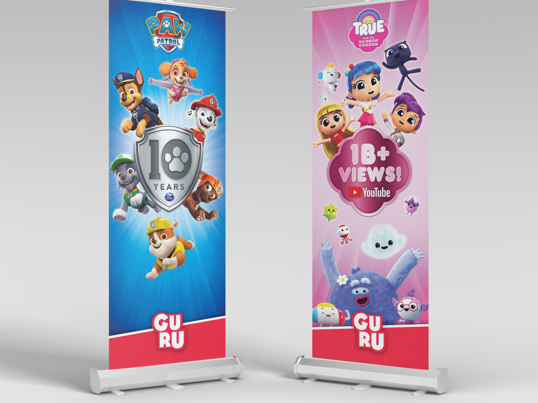
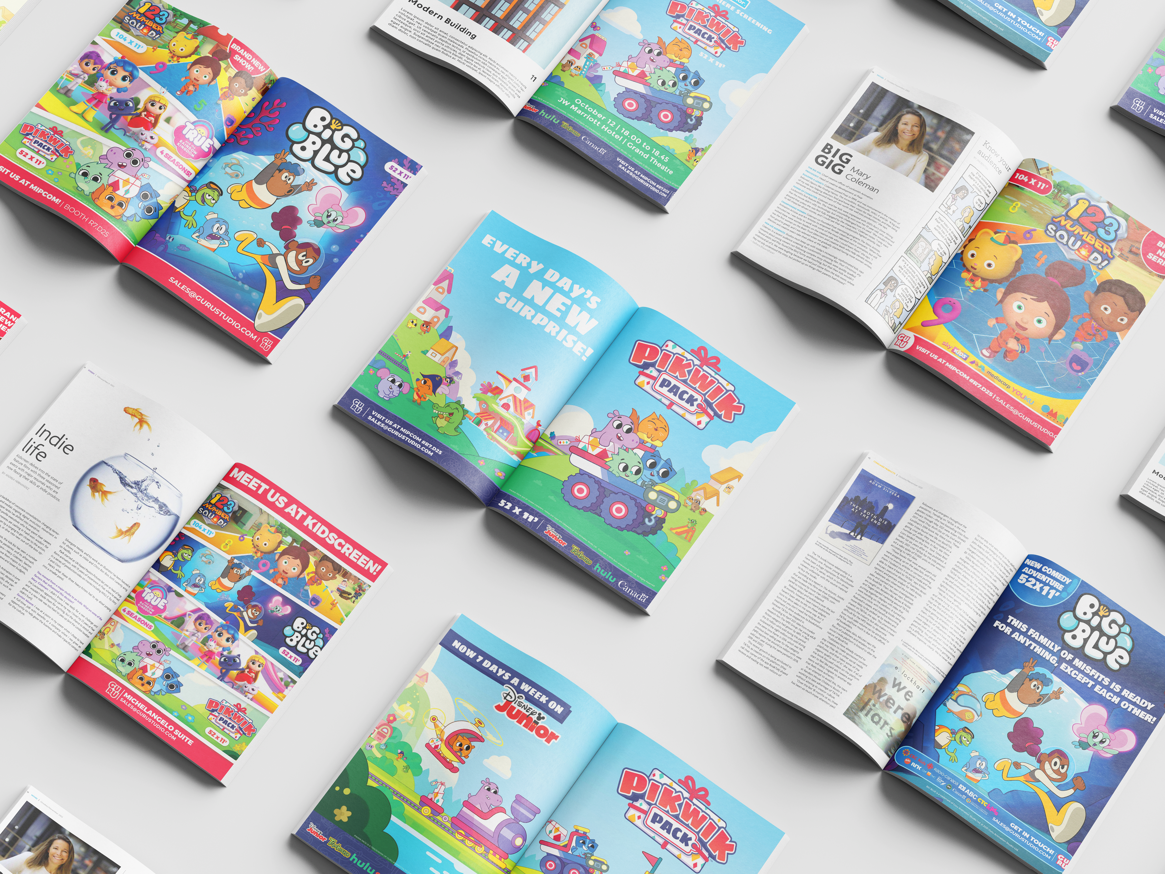
Studio Ads
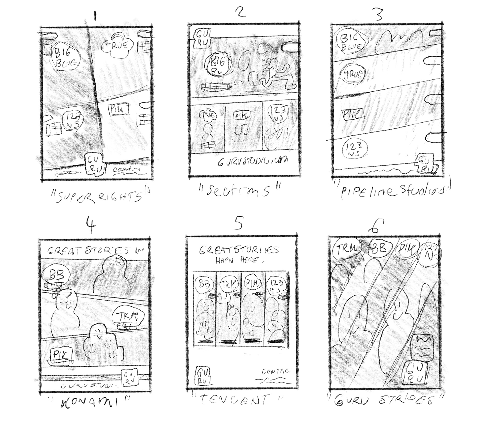
As a studio may sell a show many times before it is done, designs for these shows have to rotate to stay fresh over time. As such in this folio there are many iterations of each property - some ads appearing before the launch of a show, some much after.
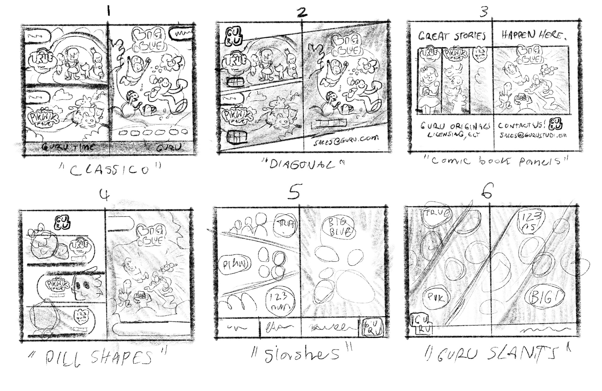
The process for freshening up designs can be seen as followed. First I take a look at what else is out there, understand trends that are happening & take stock of designs that particularly stand out. I then sketch up concepts to review with the Creative Director.
The process for freshening up designs can be seen as followed. First I take a look at what else is out there, understand trends that are happening & take stock of designs that particularly stand out. I then sketch up concepts to review with the Creative Director.
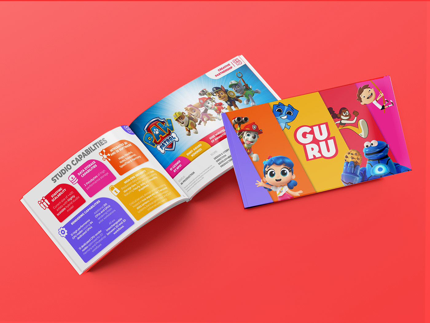
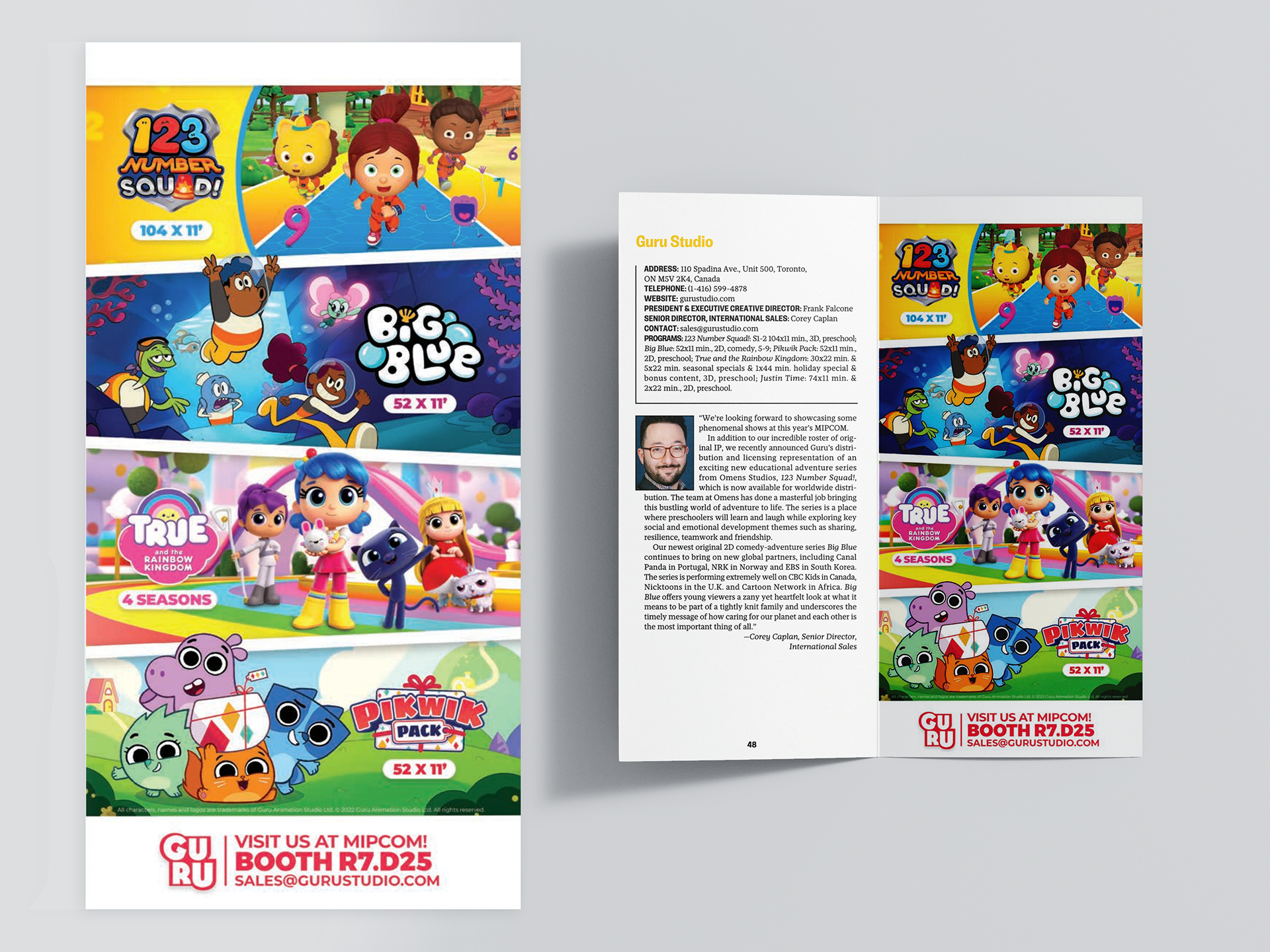
These spreads amounted to the culmination of all our internal and external brand research.
I separated the information into 3 key components - logo, format, artwork. Then I laid out the spread according to the format. Working with the 2 page format created a natural hierarchy - 3 shows on the left, 1 on the right (the immediate and most impactful view).
Then I divided the each show using Guru brand white and red shapes - anchoring everything with a simple Guru Studio maire-claire that highlights the company without taking precedence.
Finally, it was important to include logos and characters breaking out of their bounding to add fun and dynamism to the spread.
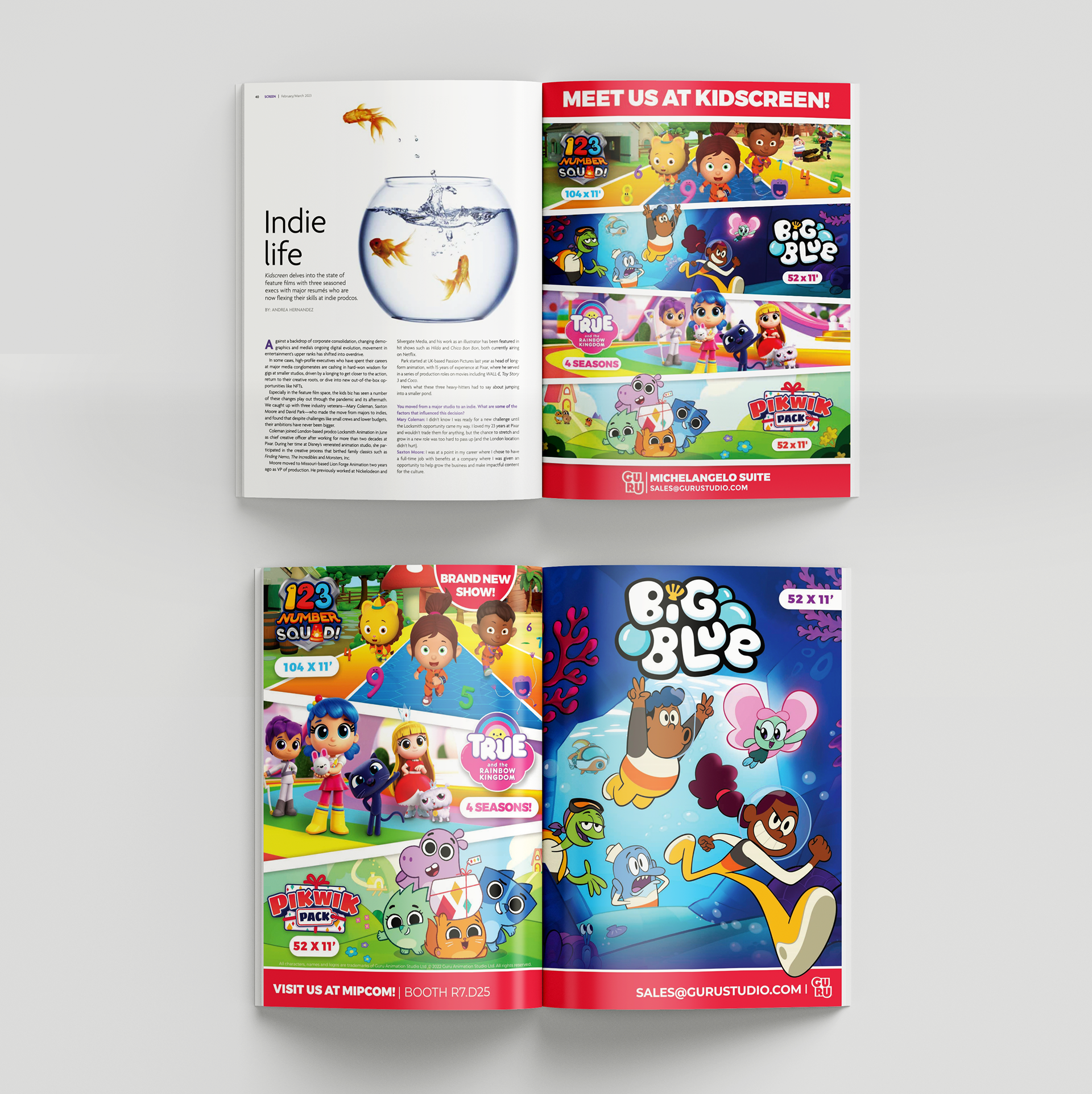
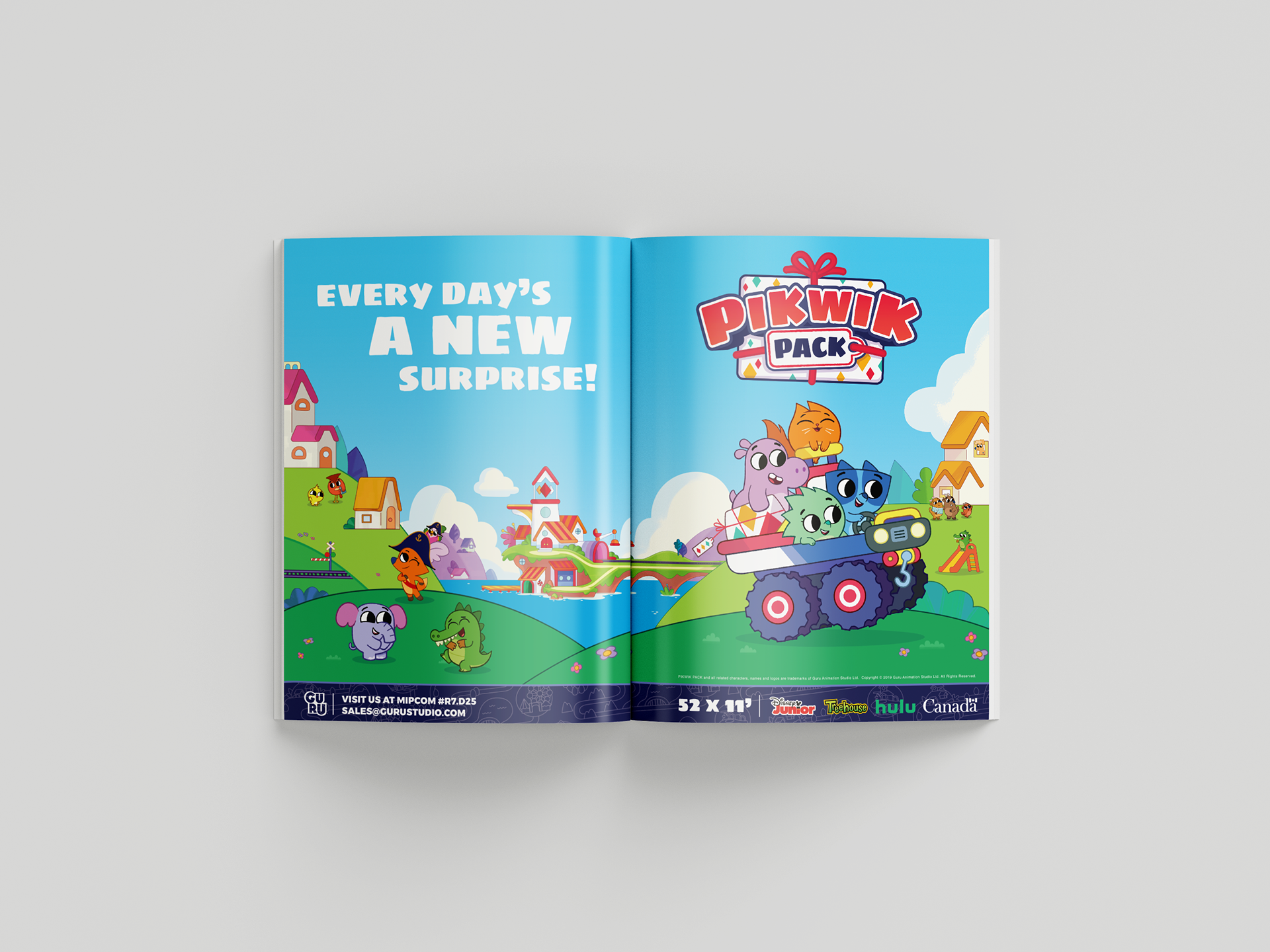
Show Ads
Throughout the year Guru Studio would strategically highlight specific IP for sale alone. Specifically in between trade-shows, where an overall Studio presence was not important. Below are some examples of some such spreads.
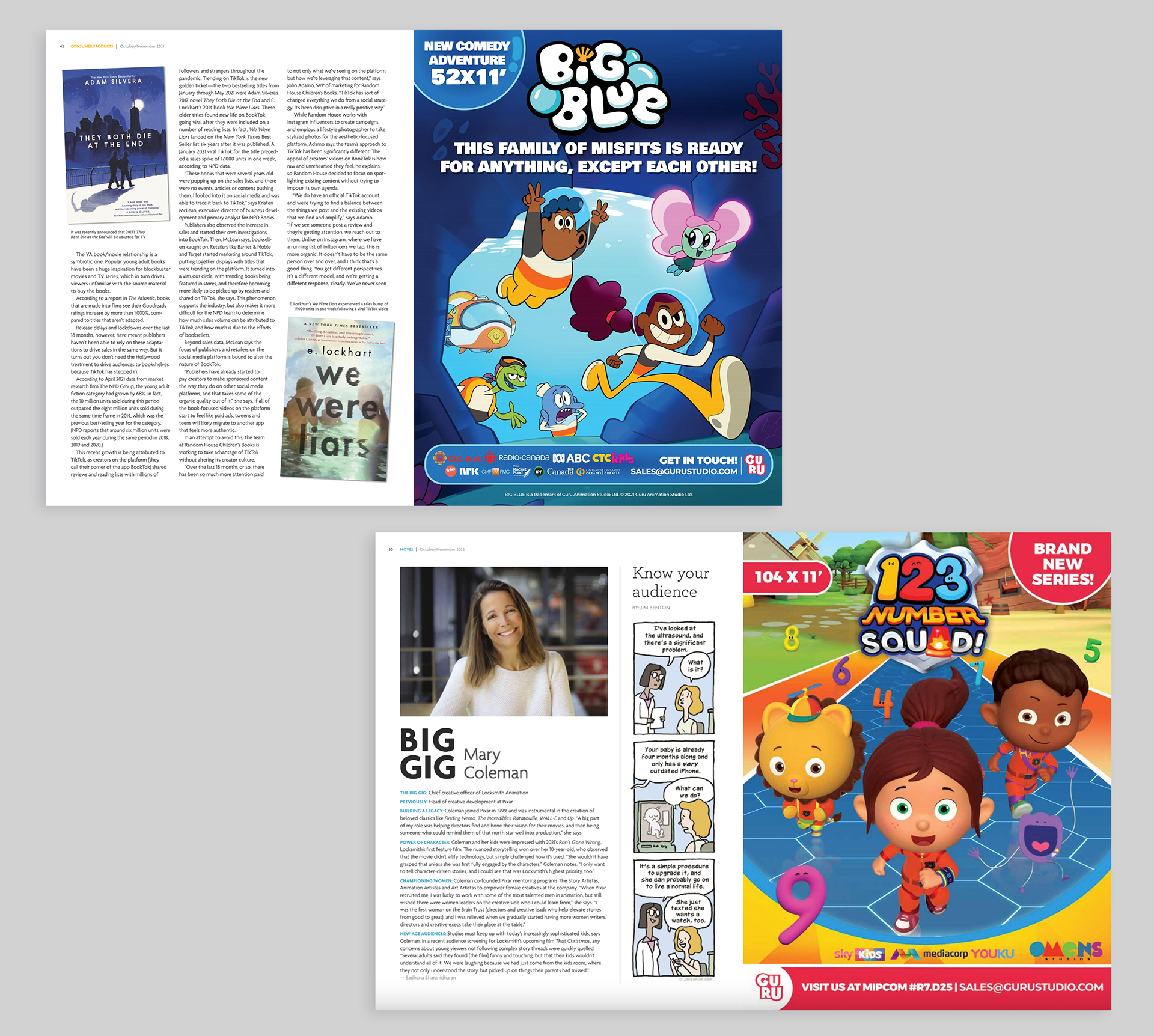
With the large amount of visual data being asked for in these, often 'good design' can come secondary. There is always room to play with the graphics - here I chose to have the same shapes slightly skeumorphed to be bubbles in the Big Blue ad, but simple in the 123 Number Squad ad.

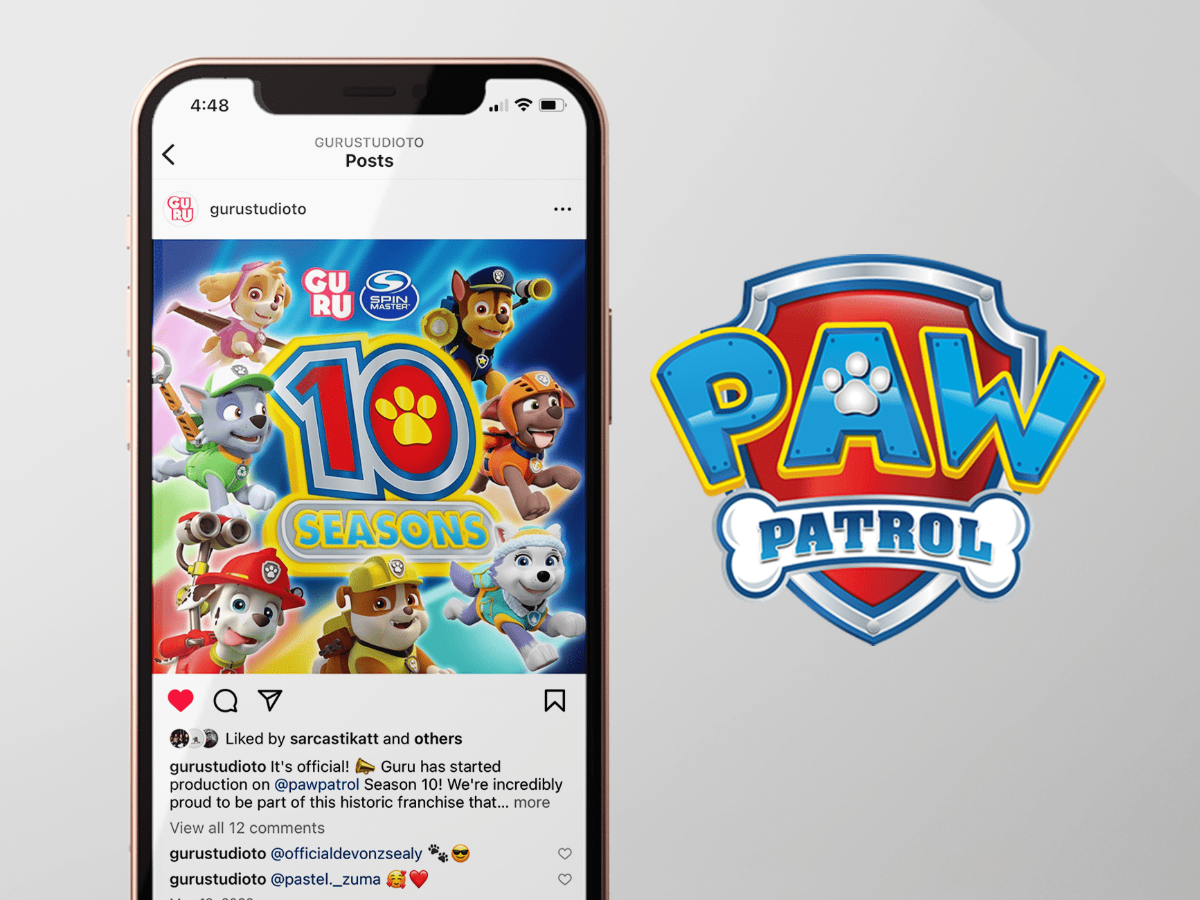
In 2020 Guru Studio celebrated 20 years. A good opportunity to advertise the studio as a whole featuring its most iconic characters. I chose to present this minimally - 1 message and art to sell the idea. The Guru logo on red is a classic arrangement for this type of ad. Appeared in a Kidscreen Eblast in 2020.
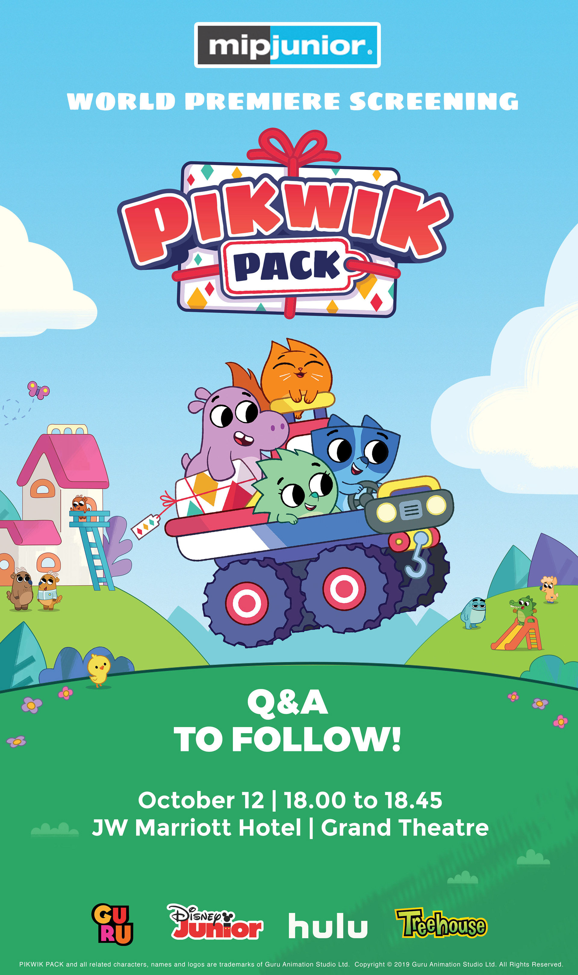
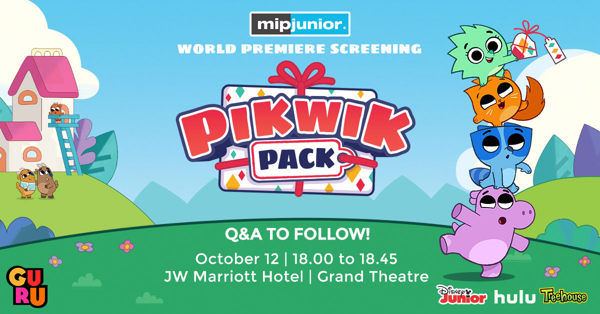
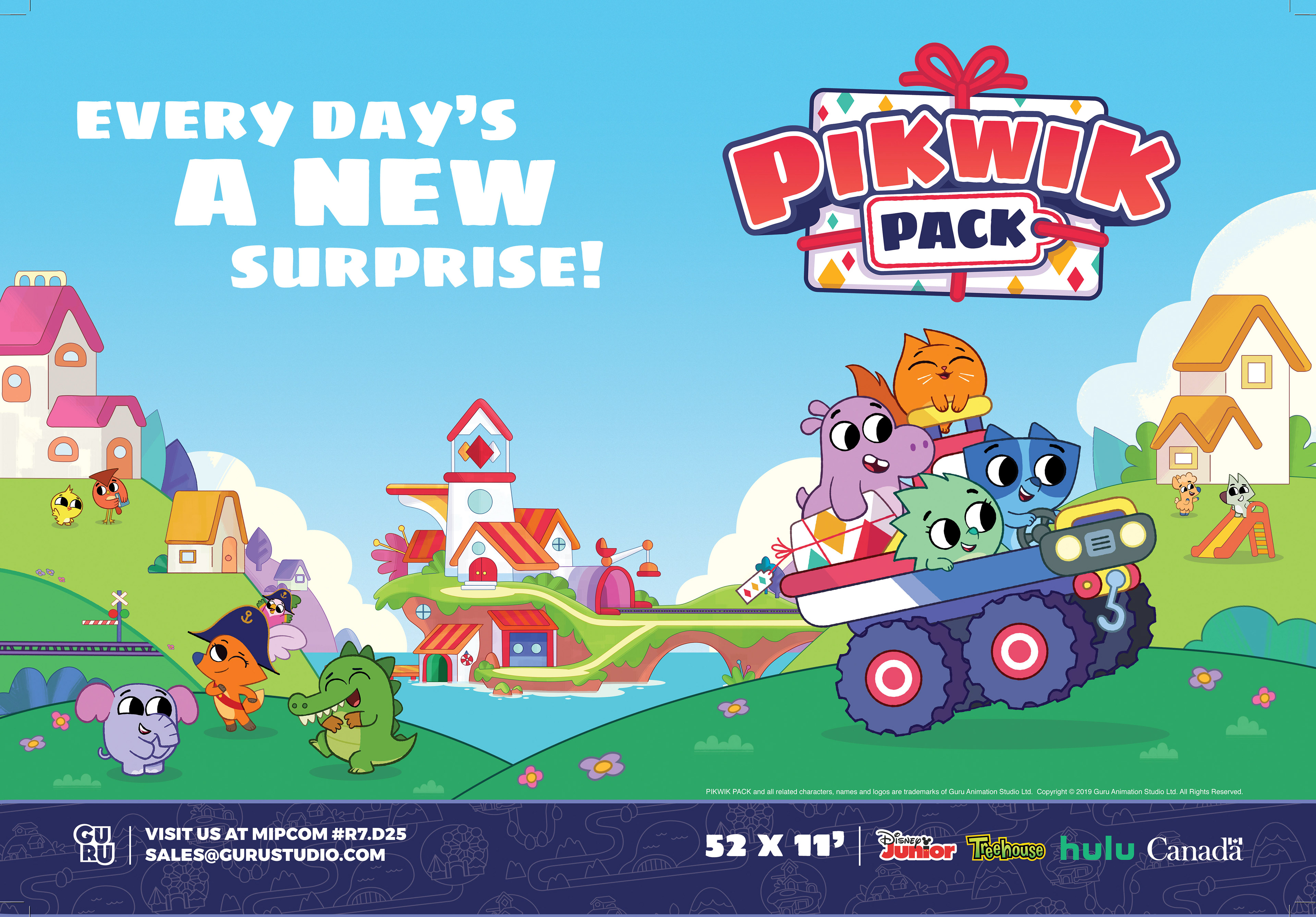
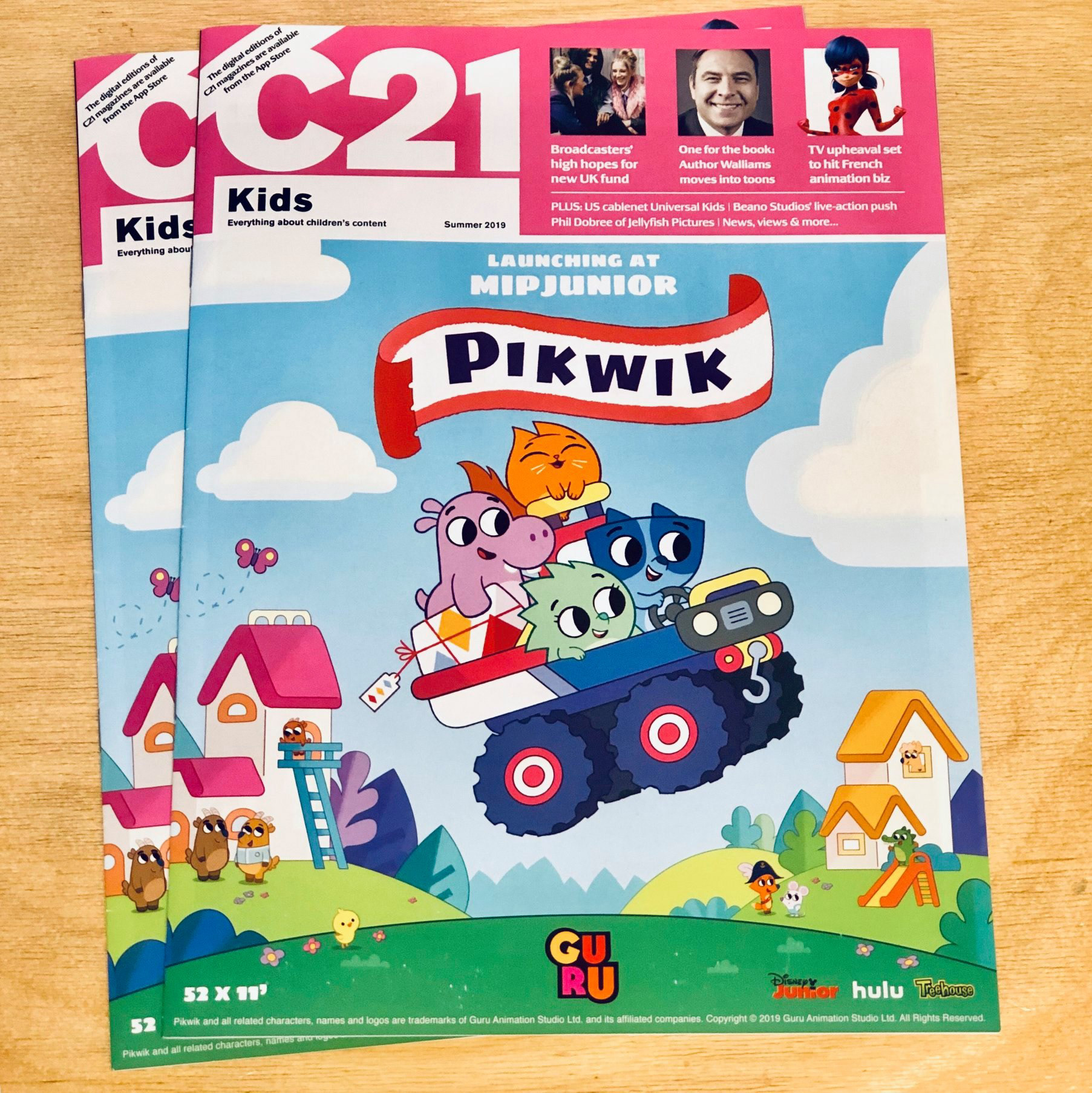
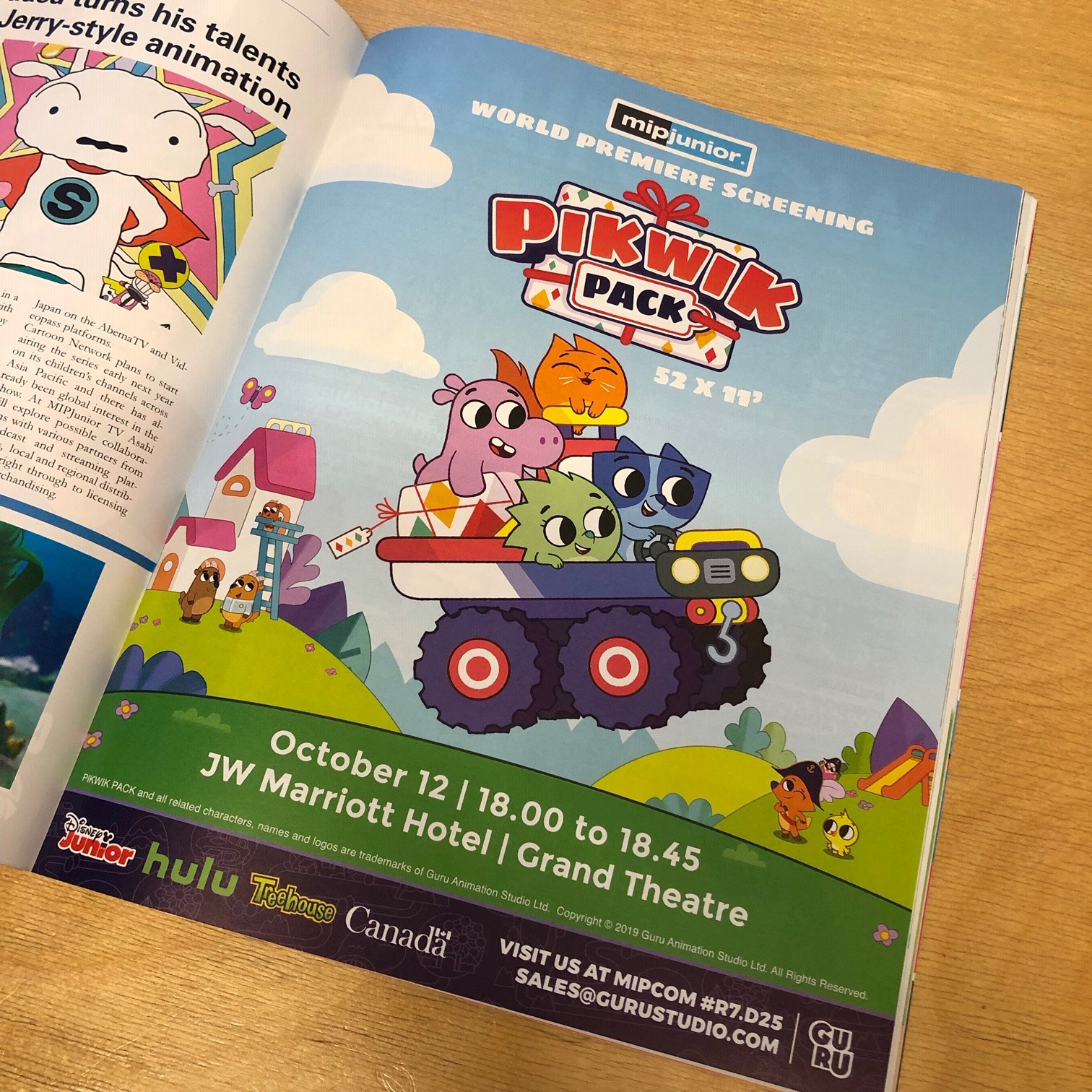
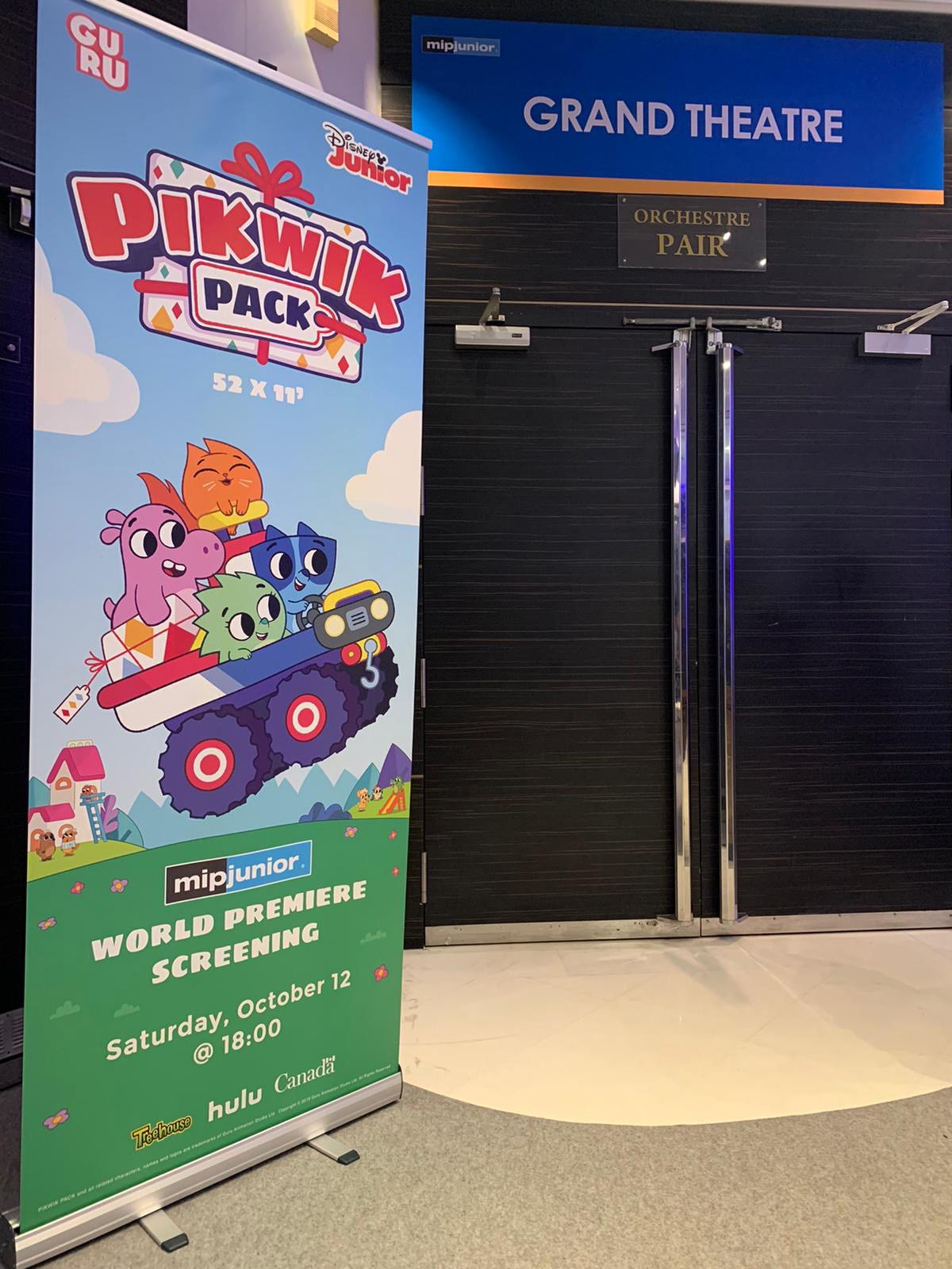
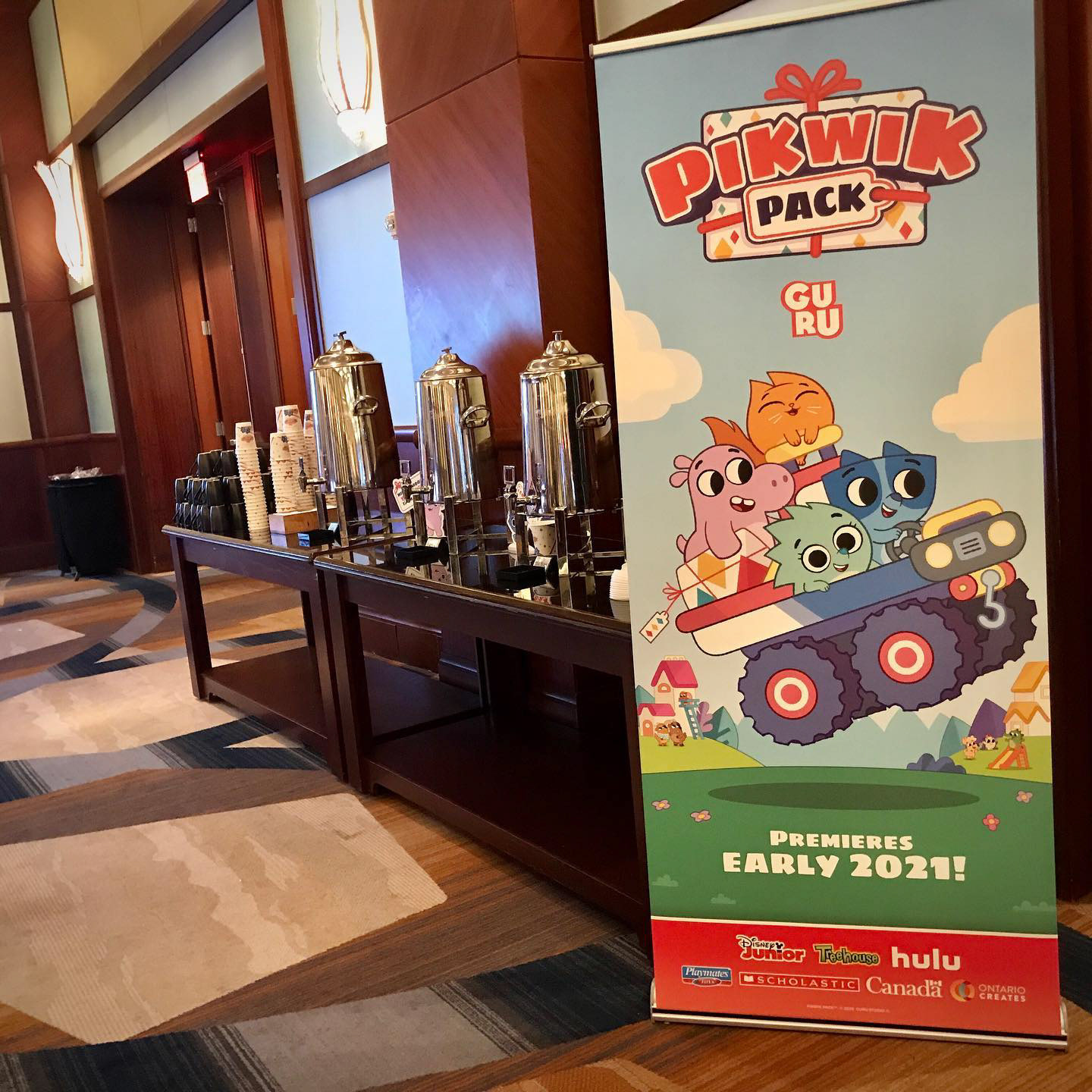
Pikwik Pack
In 2020, the big push was for Guru Studio's next big original IP - Pikwik Pack. Before episodes were even finished I was tasked with producing an iconic piece of key art with assets generated from our small design team.
We decided to focus on a lush and friendly world - making sure to hit on the 'playset' aspect as well as community, friendship and one or many of the vehicles the characters use.
Careful attention was paid to make sure Suki the Hedgehog (the green character) was the leader. I used the hill to create a natural lock-up and a v-shaped composition to focus the eye to the character art.
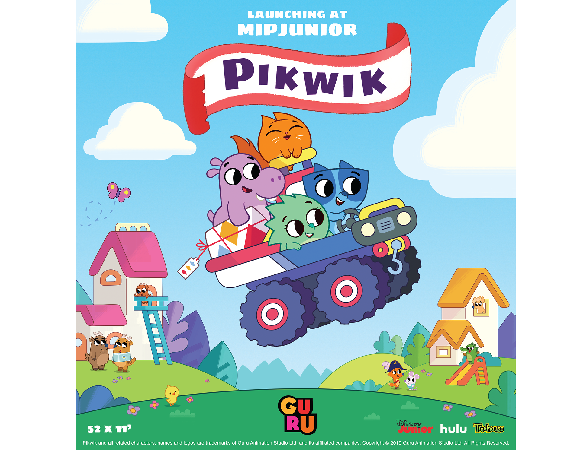
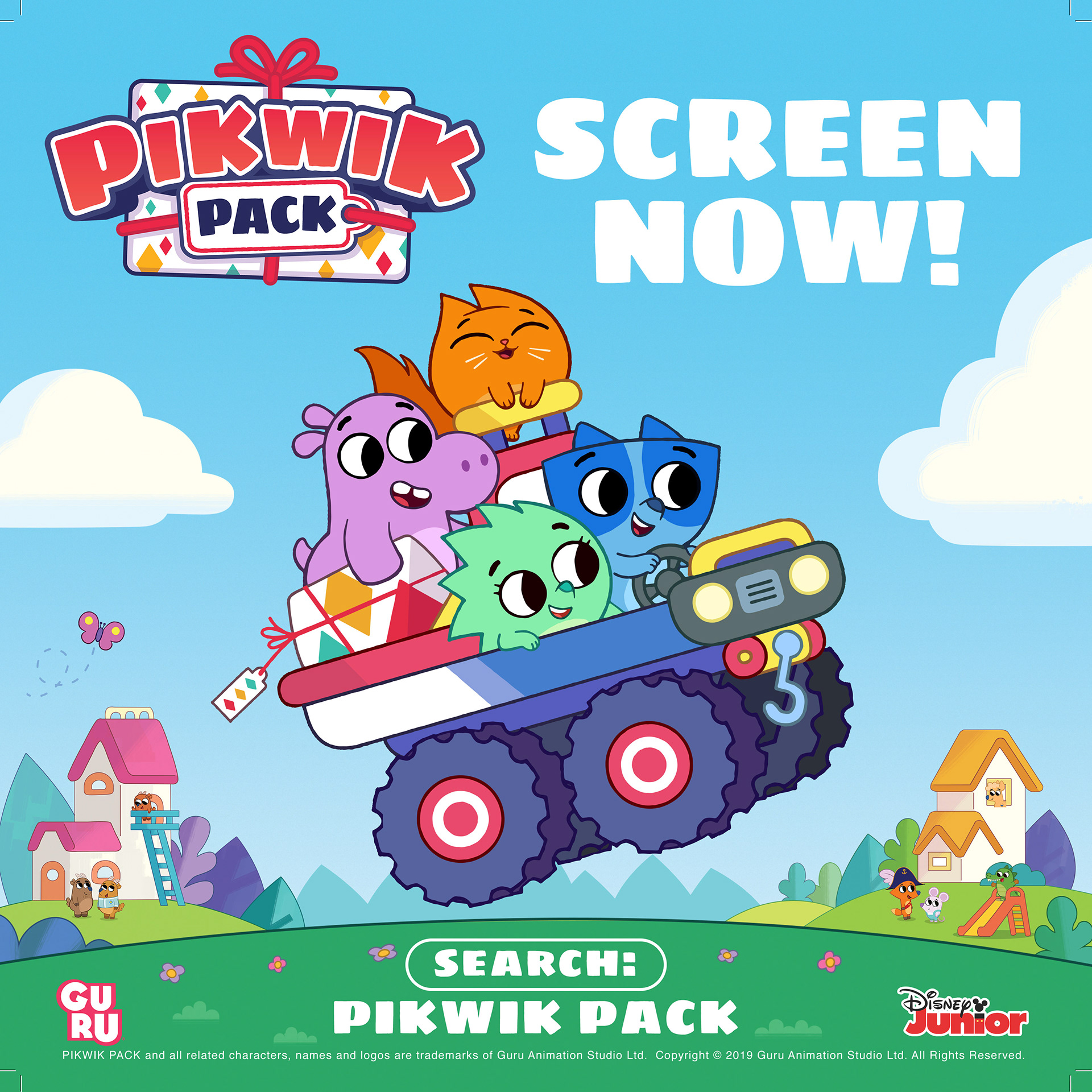
The Key art and presentation was a huge success. The campaign resulted in Pikwik Pack being the number 2 top screened episode at Mipcom for that year - beating out hundreds of others.
As well, the map-pattern used as an overlay on the maire-claires was so liked it became the main motif for the brand, appearing throughout the style guide and on packaging.
As well, the map-pattern used as an overlay on the maire-claires was so liked it became the main motif for the brand, appearing throughout the style guide and on packaging.
Final note
The process of creating digital and print ads is always interesting. Both require special attention to colour and layout. The key thing throughout all this development was to prototype and experiment with as many layouts as possible to achieve the main goal.
Thanks!